
Menu
From product group to range, from the dock
Log in to open your environment, or request a demo to get started.
Log inNo account yet?Case Nomad Fire Co. · Mobile
Researcher Steven Hoober watched more than 1,300 people to see how they hold their phone. Almost half, 49 percent, used it with one hand and tapped with their thumb. That thumb reaches the bottom of the screen easily, the top corners not. That is why Google and Apple recommend in their design guidelines to put the main navigation at the bottom.
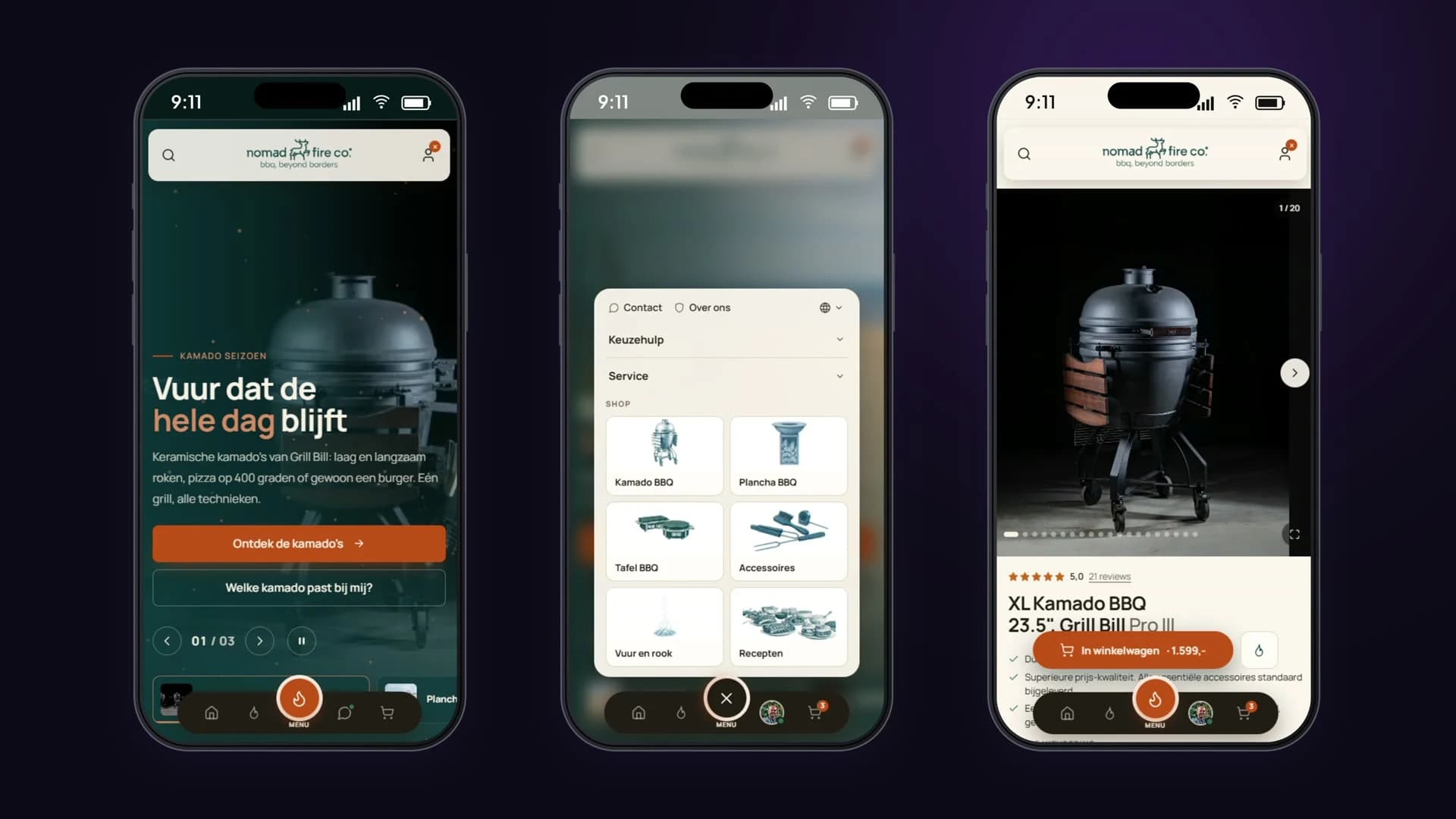
Yet most webshops keep their menu, search button and cart at the top, behind a hamburger icon. And in the bottom right a chat bubble floats right over the buttons you need. For Nomad Fire we turned that around: everything you use often sits in one dock at the bottom, and the chat is a button there instead of a bubble.
Design for the thumb, not the mouse.
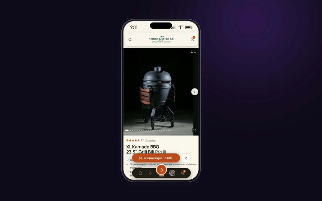
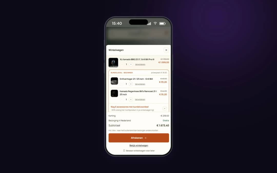
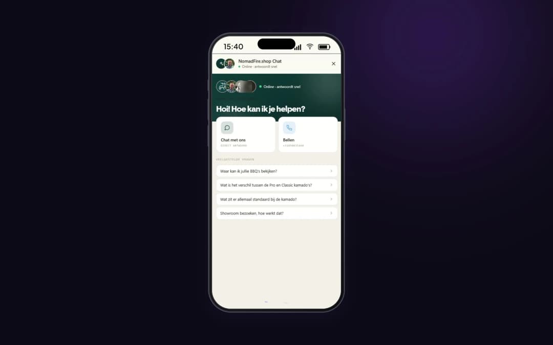
A floating chat bubble seems handy, but on a phone it lands right over the buy button or the cart. Visitors open the chat by accident, or can't see the button they were looking for. Putting the chat in the dock keeps it always available, without ever covering anything.
The header that slides away as you scroll gives a 6-inch phone its screen back. On a product page full of photos and specifications, that is quickly a fifth of the view. Anyone who wants to go back up only needs to swipe up a little, just like in an app.
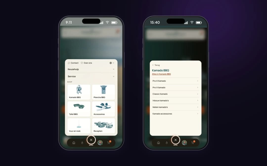
The menu as a panel above the dock keeps the thumb in the same zone. You open the menu at the bottom, pick a product group with a photo and tap through to a range, without moving your hand. The same button takes you back.
What you use often belongs where your thumb already is.