
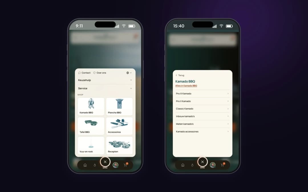
The same menu on mobile
The product groups with photos and the ranges come from the same menu editor as the mega menu.
Log in to open your environment, or request a demo to get started.
Log inNo account yet?Case Nomad Fire Co. · Mega menu

Nomad Fire sells three kinds of grills from several brands, each with multiple models and a stack of accessories. A menu with names only makes visitors open a category page first, and search again there.
The new menu opens per main group, with a tab per model and an image alongside. The visitor sees what's there before they click.
The menu is the first product page.
A customer looking for a kamado often doesn't know yet which range they want. By showing a tab with a photo per range, such as Pro III, Pro II and Classic, they see the difference in the menu already. One click later they land on the right category, instead of scrolling through a general list first.
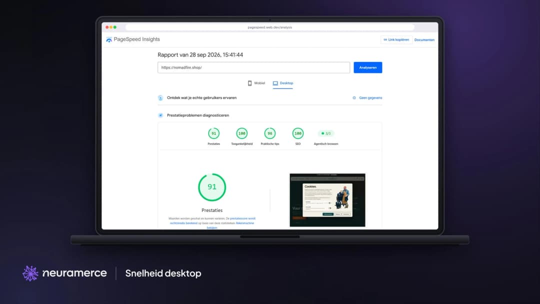
The risk of a menu full of images is weight: if every menu image loads on every page, even when nobody opens the menu, every page gets slower. That is why the menu sits at the bottom of the code and every image gets the size it is shown in. The visitor sees the page first, and the menu is ready as soon as they point at it.
Because the menu comes from the central Neuramerce menu editor, desktop and mobile share the same structure. Adding a new category is one change, and it then appears in both menus and in every language.
Show what's there, but don't make the page wait.
The mega menu that shows what is in each product group is part of the Neuramerce webshop module.